*This was all going to be one post, but I didn’t think it would show how I’m starting to think about my blog post, so “Visual, Media, Literacy: Wha?” became 2 posts. Thank you for enduring the mess of my mind.
–> Click here for “Visual, Media, Litearcy: Wha?” part 1.
recap
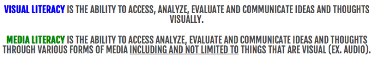
Great, so now I have a basic understanding of what these two terms (Visual Literacy and Media Literacy) are.
Next, I want to think about this in relation to the Enduring Understanding from COETAIL as it relates to the articles I read.
Enduring Understanding: Design and layout (aesthetics) of information influence effective communication.
reflect
Reading “Design Better with CRAP,” “Lazy Eyes” and “Eye-tracking studies: more than meets the eye,” I thought about how I don’t change much with font, layout, sizes, color in my blog posts. I consider myself a pragmatist and when I used to run workshops with Nancy Wong (@scampnyc) for Teach21 about Google Sites, I often looked at the customization for colors, text and all that to be impractical and just a part of making things pretty. Thus, the “prettification” (yes, I made that word up and yes, I said it out loud multiple times during the workshop) of the Google Sites we talked about and designed was usually Nancy’s part.
I was treating websites and blogs like writing a paper with not much regard for what appeals to a reader. I was not incorporating my understanding of visual literacy.

synthesize
From reading various websites and blogs, and teaching about how to write a blog and design websites, I’m coming to realize that color, size, font, the overall looks of things, the “prettification” of a site is important to communicate ideas clearly. So, here are some things that I’m thinking now:
- Color is needed to emphasize particular areas
- People are lazy, make things easier to read and find
- Avoid long paragraphs
- Make important things pop out by making them bold or changing the color
- Bullet points are easier to read
- Scrolling loses readers
- Patterns in writing are good
- Eyes are trained to read things in order, most important things should be at the beginning
- Don’t clutter
conclude
This was a great exercise in reflecting on my practices, but I do realize that I:
- wrote too much (too much text)
- had too much filler
- assumed that readers were interested in the madness going on between my ears (thank you to those who chose to stay with this post for so long)
A better post in response to Visual/Media Literacy probably would have been my “Synthesize” section and an image or something. Maybe next time…

This is the first blog post I have read after competing my course 3 week 3 assignment to embed a presentation in a post. I have to say reading your summary of visual literacy is a different experience now I’ve spent several hours trying to implement the ideas. In my presentation I tried to put color and food fore most as I figured that although I was talking about Math the promise of tasty food would maintain audience attention. I guess I opted for some high calorie synthesis.
It’s great to see how your thinking has evolved! I do think people are interested in the “madness” as you call it 🙂 Your thought process can help others clarify their understandings too. Both of these posts are really valuable, thanks for sharing!